Selected work Healthcare · Facility performance
Turning facility performance into clearer support decisions.
A post-acute care nursing association needed a clearer way to identify facility concerns and focus education and member support. I built four connected Tableau views that bring national trends, benchmarks, and facility-level detail into one investigation workflow.
VZN Designs client
View the dashboard preview- Role
- Lead Tableau designer & developer
- Delivered
- 4 connected analytical views
- Year
- 2026
The challenge
An association serving post-acute care nurses wanted to turn facility performance data into more relevant education and member support. Clinical and membership staff needed to understand where quality, regulatory, staffing, or financial concerns were emerging and which facilities warranted a closer conversation.
Answering those questions meant combining spreadsheets, data requests, external research, and clinical judgment. Organization-level averages could hide facility-specific concerns, and interpreting the signals depended on a small group of specialists. Staff needed a shared way to investigate performance and prepare focused outreach.
Which facilities need attention, and what should staff investigate before offering support?
- Performance signals sat across separate data sources
- Organizational averages could hide struggling facilities
- Measures and reporting periods were difficult to compare
What I owned and built
My ownership I owned the Tableau Prep work, metric logic, dashboard design, QA, and documentation, and took part in stakeholder discovery. A partner firm led the engagement and the upstream pipelines.
- 01Business translation
Design around the support conversation
I translated clinical and membership needs into an investigation workflow: identify a concern, compare the facility, and prepare a focused support conversation.
- 02Analytical engineering
Make the comparisons trustworthy
I prepared reporting data in Tableau Prep, built reusable calculations and benchmarks, and validated the views with the data team so measures could be compared consistently.
- 03Experience & handoff
Connect the investigation, then hand it over
I linked national, organization, facility, and domain views so staff could follow a concern through measures and trends. I documented definitions and refresh steps for handoff.
A clearer view of facility performance
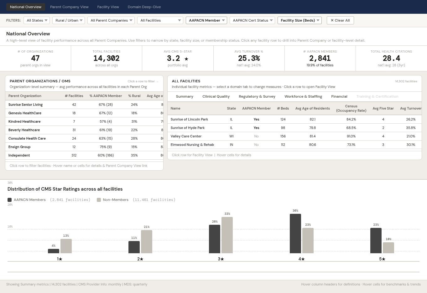
Deidentified dashboard preview
Start with the national picture, compare organizations, and identify facilities that warrant a closer look.
 Click to enlarge (image opens in a new tab)
An increase does not always mean improvement.
Some measures improve when they rise; others improve when they fall. I encoded that distinction in reusable Tableau logic, then used standardized scores and percentile rankings to put values in context. Benchmark and missing-data safeguards kept comparisons consistent across every view.
I also raised a data-linkage limit: incomplete individual-to-facility relationships constrained education comparisons, so the analysis could not establish that training caused better outcomes.
Tools & methods
Data preparation
- Tableau Prep
Visualization & experience
- Tableau Desktop
- Data visualization
- UX design
Deployment & administration
- Tableau Server
- Tableau administration
Methods & practices
- Reporting-layer ETL
- FIXED LOD calculations
- Direction-adjusted Z-scores
- Percentile ranking
- Benchmark logic
- Structured QA
Development lifecycle
- Sandbox
- Development
- Production
What changed
One path from trend to facility
Staff can investigate national patterns, compare organizations, and inspect a facility’s measures and history in one tool, rather than assembling separate spreadsheets.
A clearer starting point for outreach
Clinical and membership teams can bring specific performance concerns to expert review and prepare more relevant education and support conversations.
Consistent interpretation across views
Every view reads each measure in the right direction against the same benchmarks, giving staff a shared basis for discussing performance.
Key takeaways
Make the next decision visible.
A performance view becomes useful when staff can move from a broad signal to the facility and question that need attention.
Say what the data cannot show.
Naming the linkage limit early kept the work credible and the conclusions honest.